

Hospital Online Appointment System
This UCD project is for my internship at the Public Design Innovation Space (PDIS) under the Executive Yuan in Taiwan. We cooperated with Taipei City Hospital to improve the usability and user experience of their online appointment system.
Since the targeted users are mostly Mandarin speakers, we designed in Mandarine for all pages. However, this portfolio is documented in English. If you are a non-Mandarin speaker/reader, make sure to watch the short video I made for a quick walk through of our project!
Duration: 8 weeks
My Team: Lifei Kung, Yicheng Lai, Hanhsuan Lin, Taiwei Peng
My Role: User Researcher/Designer, Project Manager, Main Author of the poster paper
Tools: Adobe XD, Figma, Adobe Illustrator, ANOVA
Skills: User Research, High-Fi Prototype, Web Programming, Project Management, Usability Testing
Short Demo Video
This video is a short demo of the three basic functions of our website. I made the video mainly for non-Mandarin speakers to be able to dive deeper into our website. You can either watch it before or after reading through the rest of the documentation. I hope you enjoy it!
Preface
The stakeholder of this project — Taipei City Hospital — is operated under the city government. Their target users are the people living in Taipei, which means it could be every citizen. The structure of their website is regulated by the government, becoming a constraint from our (my team) point of view.
The goal of this website is not to make profits but to provide a better appointment experience and promote healthcare. The scope of this project is larger than any other project I’ve done before. However, collaborating with my team makes our research and design process smooth and effective.
Design Process Overview
Throughout the project, we conducted 13 user interviews, 3 rounds of usability testing, and collected 60 dataset (time and quantitative satisfaction) in order to get user feedback on the current and redesigned appointment website. The following documentation will incorporate user feedback into “Wireframes“ and “Prototypes“ sections, instead of separating out the designs and the testing result.
Discover
01 Stakeholder Workshop
02 User Research
Define & Ideate
03 How Might We Questions
04 Wireframe A: Ordinary Version
05 Wireframe B: Crazy Version
Design
06 Low-Fidelity Prototype
07 Medical Personnel Interview
08 Stakeholder Follow-up
Develop
09 High-Fidelity Prototype
10 Responsive Web Design (RWD)
11 Web Programming
12 Quantitative Achievement
Discover
01 Stakeholder Workshop
During the workshop, the website managers of Taipei City Hospital introduce their current appointment website, their mission, and structural constraint.
Current Website (Mandarin version; English version)
Landing page of the appointment website: All branches and departments are listed alphabetically in Mandarin. It is hard to find the desired departments or where they’re located.
The outpatient schedule: The display doesn’t indicate how to make an appointment. The overuse of colors make it visually difficult to look for specific doctor(s).
Mission of Appointment Website
“To bring medical service closer to everyday life. To promote health education.”
Structural Constraints
Government Regulation
Web Accessibility
02 User Research
After getting input from the stakeholder’s perspective, we recruited 13 participants and conducted structured interviews with them. The interview is consisted of three parts:
Past Experience Sharing, to understand the role the appointment website plays during this process.
Tasks with SUS and QUIS Form, to find out current problems of the website and understand people’s subjective experience with the tasks, including making and cancelling an appointment.
Semi-structured interview, to verify the findings from the previous tasks.
We made an affinity diagram to analyze the results (see the photo below). From there, we concluded three functional problems while using the website, and three user needs either mentioned or observed during the interview.
Functional Problems
Unorganized Layout: overused colors, repetitive announcements, and confusing tables
Unclear Information Feedback: the most important information shown in browser pop-ups
Poor Information Accessibility: difficult to distinguish important information; usage of words does not match users’ past experience
User Needs
Efficiently arrange the time before and after visiting the hospital, based on the information provided online.
Straightforward usage of words that match their past experience
Quickly complete online appointment, by providing clear visual presentation, easy-to-read content, intuitive searching process

Unsorted sticky notes collected from the interviews. We then sorted them into different topics.
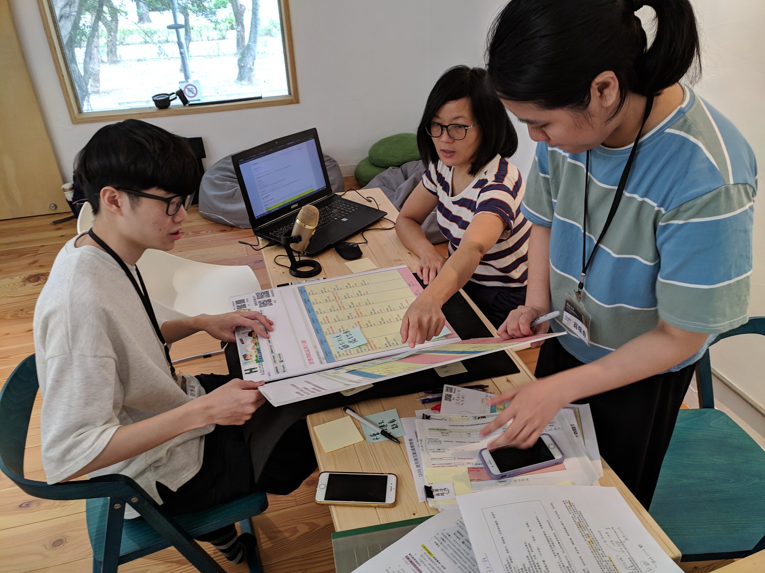
User Interview with webpages on foam boards. This allowed users to directly point to where the problem is.
Based on the findings during the interviews, we made three personas and three respective customer journey maps (see the photos below). The three persona has very different needs and characteristics:
Mrs. Wang: 61 years old. She is a first time user of the appointment platform. She needs to spend some time figuring out new functions.
Ms. Wu: 45 years old. She has numerous experience making appointments online. She’s busy and always struggles with finding a time to visit doctors.
Mr. Liu: 27 years old. He has a master degree and is familiar with website navigation. Instead of reading every text on the page, he used shortcut keys to find the desired information.


Define & Ideate
03 How Might We Questions
Based on the user research findings, we concluded three How Might We (HMW) Questions that we continue to ask ourselves during the design process:
How Might We allow users to use the information online to efficiently arrange their time?
How Might We speed up the appointment process?
How Might We make sure the information presentation match the users’ expectation?
To answer the above questions, our mentor suggested us to make two versions of the wireframes: one ordinary version, and the other crazy version. The ordinary version could help us understand the structural constraints of a governmental website better; the crazy version allowed us to think out of the box and create new ideas.
04 Wireframe A: Ordinary Version
The ordinary version structurally follows the original website. We only made changes to the layout of different components, including the hospital branches/departments list, outpatient schedule, and appointment confirmed page.


List of Branches. Instead of pure texts, we made the list into grids that consist of both texts and pictures. This is to help users faster associate the name of the branch to its building, and to organize the layout better.

Outpatient Schedule. We made each doctor’s section into a card which includes the doctor’s introduction and a registration button.
Usability Testing & User Feedback
In this stage, we mainly focused on the qualitative feedback our participants provided, because quantitative data can change hugely based on the different design decisions we made later.
(v) Layouts of the landing page and outpatient schedule are clear
(v) Call-to-action of each button is clear
(x) Progress bar is currently unclear
(x) Texts size ratio needs to be rearranged
05 Wireframe B: Crazy Version
The crazy version breaks the original frames and adds to more functionality that an appointment system could provide. The largest change is that we create an immersive experience for the appointment process. Users are led by questions that help them complete their appointment. We also added map and proposed a symptom suggestion system (Suggested Appointment Based on Your Symptom, SABYS) to help patients choose which departments to visit. I was in charge of the integration of this version.


Map of Branches. The purpose was to help people who are not familiar with Taipei to easily locate each branch.

Suggested Appointment Based on Your Symptom (SABYS). This new function allowed people to associate specific departments with their symptoms.
Usability Testing & User Feedback
(v) High affinity and interaction
(v) “Immersive experience can increase people’s willingness to use the website.”
(x) Time-consuming
(x) The appointment suggestion system may not be reliable
Design
06 Low-Fidelity Prototype
Structure of Wireframe A + Creative Components of Wireframe B = Low-Fi Prototype
Specifically, we took away the Suggested Appointment Based on Your Symptom (SABYS) page after analyzing its feasibility and reliability. However, the user feedback on the need of this system made us falter (see the forth point of user feedback below).


Structure of Wireframe A: Outpatient Schedule. We experimented with the layout of the doctor’s card to simplify the overall visual complexity.

Component of Wireframe B: Map. The map will show different branches on the map while clicked.
Usability Testing & User Feedback
(v) User flow is smoother
(v) Information Presentation is clear and clean
(x) Desire to have more personalized functionality
(x) Still need a system to help determine which departments to visit when certain symptoms develop
07 Medical Personnel Interview
In order to make the Suggested Appointment Based on Your Symptom (SABYS) system more reliable, we interviewed four medical personnel to get their input.
Overall flow: choose from “common symptoms“. If symptoms not included, choose body parts and symptoms from the body diagram. Lastly, choose suggested departments/divisions.
Keep suggested departments/divisions from 1 to 5, to satisfy both the public and the medical personnel’s expectation
Promote health education, with warnings or medical suggestions shown on the webpages
08 Stakeholder Follow-up
Upon the completion of low-fi prototype, we visited the website managers of the Taipei City Hospital to get their input on our current design.
Integrate GPS into the branches map, so users know which branches are closer to their current location.
Consider the need of RWD, since mobile device users count for 70% of all users.
Develop
09 High-Fidelity Prototype
Based on the feedback received during the previous round of usability testing, we sophisticated the following functionalities of the appointment website:
Make an appointment according to desired branches, departments/divisions, or doctors
Cancel an appointment
Search for outpatient service progress
Search for departments/divisions suggestion based on the Suggested Appointment Based on Your Symptom (SABYS) system

Click the above image to access the Adobe XD full prototype!

Click the above image to directly land on the SABYS page!
10 Responsive Web Design (RWD)
Since the website managers told us that 70% of the users access the appointment system through mobile devices, we designed a RWD version of our website in only two weeks. This is not within the scope of this project; however, our designers made the prototype as comprehensive as possible.

Click the above image to access the prototype of RWD!
Usability Testing & User Feedback
(v) Outpatient Schedule is intuitive
(v) Text size is large; overall layout is easy to read
(x) Hamburger bar is not intuitive for the older generation
11 Web Programming
Even though the scope of this project does not require us to deploy a real website, our engineer (Han Hsuan Lin) wanted to demo the most realistic website. As a result, he built a website featuring the two main functions: making and cancelling an appointment.

Click the above image access the real website of our prototype!
12 Quantitative Achievement
To test if our redesigned website is actually more efficient than the original one, we tested 4 versions of the site — the laptop version (original and redesigned) and the RWD version (original and redesigned) — on 60 users, each of whom only got tested on one version.
Below is the quantitative data we collected, calculated, and presented through the ANOVA table. Looking into the table, when the P value is less than 0.005, that means the change is significant. The above table indicates that our redesigned website provides a more efficient experience to users; however, the below table indicates that the RWD version does not significantly improve the efficiency.
Based on the qualitative feedback we got from usability testing, we suspected that the reason why the RWD does not perform as expected was because of the hamburger button — something that is unfamiliar to most elderly people. We are hoping to redesign the hamburger button in the future to better indicate its functions.

Reflection
| Working with Designer, Researcher, and Engineer
Different from the past class projects in which I always work with people in my department (designer and researcher), my team for this internship is consisted of designer, researcher, and engineer. As a team leader, one thing I learnt the most was to communicate between different roles — to engage engineer into the research process, and to let designers and researcher know what the engineer is working on. Reflecting back to what I learned in school, the introductory class of web programming helps me a lot in team communication.
| Learning Different Design Tools
As a designer, I was more familiar with Figma than Adobe XD. In fact, I designed the Wireframe B with Figma. However, since the main designers in my team was more used to Adobe XD, we changed our design platform to Adobe XD in the middle of the design process. The way I pushed myself to learn was to let the design share his screen while designing and demoing, and I would ask questions about Adobe XD functionalities while I was confused. This way, I was able to learn new skills in such a short span of time.
| Hybrid Working Mode: How Is Remote Working?
This internship was hybrid — other than the user and stakeholders interviews, usability testing, and presentation conference, we spent most of our meeting and working online. This was especially challenging at the beginning, since people can easily get distractive while working remotely.
We gradually optimize our time usage during online meeting by: 1) follow a rough time schedule instead of discussing freely, 2) meeting is for decision-making-related work; leave individual work as a take-home assignment, and lastly 3) jump in and encourage everyone to talk while the meeting hits silence.
Though I personally still prefer working in-person, during this pandemic I am more confident in working remotely at home. I definitely need to practice more about personal time management, but I believe that with this experience, I will be able to get used to new working environment more easily.
Most Important of All…
I would like to thank my two mentors — Hao Ting Chang and Kang Ku Lin — for supporting my group and providing numerous constructive feedback on our project. They also gave me great advices on future career path.
Also, huge thanks to Audrey Tang, the Digital Minister of Taiwan who organized this internship program.
Lastly, I appreciate the hard work my team members devote into this project, and I hope we will be able to work together again in the future!